|
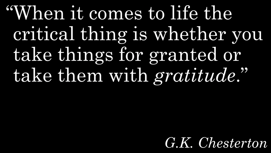
For this simple and elegant quote from G. K. Chesterton about the critical difference between taking things for granted and taking them with gratitude, I decided to keep the slide simple and elegant. That being said, I did make some pretty important design choices that are not entirely noticeable but that do make a difference. First, notice that the opening quotation mark is hanging to the left of the text. This gives the block a cleaner line. I chose Century Schoolbook for the font to give it a classic feel. There's a lot to love about this font. Look at that lower case g. I also really like the lower case i. It has a beauty that you just do not get with a sans serif font. Speaking of serifs, take a look at how the capital W and the lower case h are playfully almost touching at the top.
Ever wonder who this G.K. Chesterton guy is? Apparently a lot of people have. Learn more about him at chesterton.org/who-is-this-guy
0 Comments
Leave a Reply. |


